Snazzie Designz

Design, And Everything Design Related

Posts Tagged ‘pyrograph’

Re-Fillable Wooden covered A4 journal with Tarot themed cover designed, handmade and pyrogrphed (wood burned) by snazzie Designz.

The paper used is high quality smoke lorenzo paper but you can add in lined paper, printed pages or any other type of pages you like.

Handmade Refillable A4 Tarot Journal by Snazzie Designz

Handmade Refillable A4 Tarot Journal by Snazzie Designz

To add or remove pages from the book you unscrew the binding posts and then add or remove punched A4 pages and replace the screw binding posts.

Handmade Refillable A4 Tarot Journal by Snazzie Designz

The front cover has a maple veneer inlay with a purfling surround, and the cover edges also have a purfling edges.

Handmade Refillable A4 Tarot Journal by Snazzie Designz


To see more re-fillable wooden covered A4 books/journals click here.

This is a one off hand made Coptic bound book inspired by the wonderful haiku collection of Harry Wells (Aldwarke).

The front cover is bamboo with 5 different veneers, and pyrographed outlines. The back cover has the Kanji for “Haiku” 俳句 pyrographed onto a marquetry cover. I’m not sure what the central veneer is but it is pearlescent and glimmers in the light. On the inside pages there is a collection of Aldwarke’s haiku and short poems that I illustrated. I’ve done up an animation simulating the book opening so that you can see the pages illustrated.

Handmade Coptic Bound Haiku Book by Snazzie Designz

INTERACTIVE – CLICK TO TURN THE PAGES

Handmade Coptic Bound Haiku Book by Snazzie Designz

Handmade Coptic Bound Haiku Book by snazzie Designz

Handmade Coptic Bound Haiku Book by Snazzie Designz

You can flip through the book here if you like, or to read this beautiful collection of haiku story in full and more of Harry’s wonderful writings please check out his blog “Aldwarke’s Anthology” here.

Handmade Coptic Bound Haiku Book by Snazzie Designz

For a full list of all of the WellSnazzie Collaborations please click here.

To see more of Harry’s remarkable craft work check out his gallery on deviantart here.

Handmade Frame and Fan decorated with a Japanese Ukiyo-e Birds in the Plum Tree pattern

Hand made frame and fan pyrograph by snazzie designz

This beautiful handmade walnut and American oak frame and Baltic Pine fan were made by by Harry Wells.

Handmade walnut and American oak frame by Aldwarke

I had the very great pleasure of decorating the fan with a Japanese ukiyo-e inspired pyrograph (wood burning). The specific ukiyo-e is the Toshi Yoshida woodblock print “Spring”. “Hakubai ni Mau” translates as “Flying around the Plum Tree”.

I experimented on both sides of the fan. On the second side I experimented with distorting the outlines to match the fan folds to give it a more 3D look. I’m not sure if it succeeded entirely but was an interesting challenge nonetheless.

Handmade Framed Fan Pyrograph both side by snazzie designz


To see more of Harry’s remarkable craft work check out his gallery on deviantArt here.


WellSnazzie Collaborations Logo by snazzie-designz

For a full list of all of the WellSnazzie Collaborations please click here.

This incredible chisel box was made by Harry and I had the very great pleasure of decorating it with Japanese inspired imagery.

The chisels are marvellous Kirshcen brand chisels. Kirschen means “cherries” in German, so I decided to do a cherry blossom themed box to match. The cherry blossom designs are inspired by Japanese ukiyo-e woodblock prints.

Handmade chisel Box With Cherry Blossom Pyrograph by snazzie designz

Handmade chisel Box With Cherry Blossom Pyrograph by snazzie designz

Handmade chisel Box With Cherry Blossom Pyrograph by snazzie designz

Handmade chisel Box With Cherry Blossom Pyrograph by snazzie designz

I continued the Japanese theme on the underside with a Japanese dragon.

Handmade chisel Box With Cherry Blossom Pyrograph by snazzie designz

WellSnazzie Collaborations Logo by snazzie-designz

For a full list of all of the WellSnazzie Collaborations please click here.

To see more of Harry’s remarkable craft work check out his gallery on deviantart here.

This is a handmade framed pyrograph (wood burning) of “The Lady of Shallott” based on the Alfred Lord Tennyson Poem (1842 Version Part IV).

The Lady of Shalott  Handmade Frame and Pyrograph Animated by snazzie designz

This stunning handmade frame is made by Aldwarke. Loosely inspired by Kit Williams pieces, Aldwarke took an idea and created something truly spectacular with it. The combination of American oak and meranti are such a complimentary pairing, and show off the Baltic pine background beautifully. Baltic pine is ideal for wood burning also, so that makes my job so much easier. The frame was made so seamlessly that the Baltic pine background sloted in snugly. This had great significance when it came to the woodburning, as any slippage would have resulted in misalignment and disaster. Details that people often overlook in such things are the finish and the surface. The frame arrived clean, and sanded so smoothly that it looked polished. Working with this type of piece makes my part so much easier.

Starting with a stunning frame hand made by :iconaldwarke: aldwarke my initial thoughts were Wow! It’s beautiful… please don’t let me mess it up! My second thought was that I needed to turn it upside down!

The Lady of Shalott  Handmade Frame and Pyrograph  by snazzie designz

The Lady of Shalott  Handmade Frame and Pyrograph Inside Panel by snazzie designz

The inside backing piece on it’s own. Made of Baltic pine it was a lovely surface to burn, and Adwarke’s precision in sizing it meant that it fitted snugly into the frame with no slipping, allowing me to align this with the extension of the picture onto the frame itself.

As soon as I saw the curve I knew I wanted to make that curved edge represent the edge of the boat, and have her hair and robes flow over the edge as described in the poem. How to achieve that was a new challenge. Meranti wood is a beautiful rich colour for the frame, but it would be too dark to represent the white robes described in the poem. I decided to give marquetry a go for the first time.

It was not an easy decision for me to try it, even after a reasonably successful test piece. I took it down and put it back on the shelf again for several months thinking about it. Even after months, I couldn’t see the frame in any other way than as part of the boat though, so in the end I just had to hope for the best, and to be very grateful for Aldwarke’s understanding and blind faith in me!

The Lady of Shalott Handmade Frame and Pyrograph Test Pieces by snazzie designz

The scrollwork, the lady’s gown and hair on the frame were all done with marquetry. I penciled onto maple veneer, burned, shaded and then cut out each piece individually. This was a tricky business with veneer having a tendency to split. I used masking tape on one side to reduce the likelihood of splitting.

Once cut out, I had to size and position the veneers very precisely on the frame. Unlike usual marquetry where the outside design is also veneer, I didn’t want to hide Aldwarke’s beautiful frame, so I had to carve directly into the frame itself, knowing that any slip ups were not going to be able to be undone, and the frame would be destroyed. Once in place, I traced around the cut out veneers, and then chiselled out a hole the exact size into which the veneer would slot. For the most part I got it right in the end I think. I just did the robes and hair freehand as they had to align precisely with the inner picture, and with the horizontal pieces.

I wasn’t sure what option I would go for for the boat’s prow so I did a few different ones to try them out. I opted for the swan design in the end, as I thought it was more reflective of the Lady of Shallot. The boat on the inner picture had to line up precisely with the frame or the whole thing would be a mess. Thankfully Aldwarke’s absolute precision came to the fore here, and his excellent skills meant that the backing fitted so snugly that it didn’t move at all. Such skill is to be envied.

The Lady of Shalott  Handmade Frame and Pyrograph  by snazzie designz

The Lady of Shalott  Handmade Frame and Pyrograph Bottom by snazzie designz

The Lady of Shalott  Handmade Frame and Pyrograph Vert-WM by snazzie-designz by snazzie designz

WellSnazzie Collaborations Logo by snazzie-designz

For a full list of all of the WellSnazzie Collaborations please click here.

The Covenant Pyrograph/Carving Top by snazzie-designz

Harry Wells (Aldwarke) and I have collaborated on a number of projects now and usually my talented collaborator makes marvelous wooden pieces (frames, boxes etc) and I have the great joy of decorating them with pyrography (wood burning).

This collaboration was slightly different. What many people may not realise is that not only is Aldwarke a master craftsman, but is also a beautiful writer and has an anthology of delightful and insightful stories and poems. It was within this literary treasure trove that I discovered “The Covenant”. This story was so inspirational to me, that I knew straight away that this was the perfect story to decorate this magical piece of wood.

Do yourself a favour and read this beautiful story in full Aldwarke’s Anthology blog and you too will understand how fitting the story and the wood are to each other.

The Covenant Pyrograph and Carving by snazzie-designz


The Covenant Pyrograph and Carving Zoom 01 by snazzie designz

The Covenant Pyrograph and Carving Zoom 03 by snazzie designz


It all began with a magical slice of pine wood, from a fallen pine tree in the sacred site of Monasterboice, Ireland. The wooden slice measures 1.6 x 0.5 metres (5’3” x 1’7”). After 2 years of looking at it sitting in my kitchen waiting for just the right piece of inspiration to do justice to this very special slice of wood, it finally hit me.

There were a number of new challenges for me on this project. This immense slice of wood is by far the biggest single piece of wood I’ve ever worked with, and I didn’t have a workbench big enough to accommodate it, so I had to make a temporary stand of sorts for it.

The Covenant Pyrograph and Carving Blank Wood by snazzie designz

It took a HUGE amount of work to sand it all down level and smooth on both sides using an angle grinder first, then a belt sander and then hand sanding to finish.

My sander just wasn’t up to scratch for this, and would have taken about 2 weeks to sand it properly, so I rented a belt sander. The guy in the shop said “It’ll do a jig on ya” and I learned pretty quickly what he meant by that! However, the belt sander was fantastic, and the entire surface was smoothed to a satin surface within 2 hours.

There was a substantial crack on the front, which I had to fill in and match the changing colour of the wood, which I hopefully achieved. It looks a lot less obvious now than it did anyway. There was mould on the back which I had to clean up, and eliminate before reinforcing the back and strengthening the waney edges so that they didn’t chip. Thanks to Aldwarke for letting me know that the bark edges are actually called waney edges. He almost makes me sound like I know what I’m talking about!

The Covenant Pyrograph/Carving Work In progress by snazzie-designz

This was also my very first attempt at carving a bas relief, and also my first attempt at a combination of carving and pyrography. I learned quite a few things along the way.

The Covenant Pyrograph/Carving Work In Progress by snazzie-designz

Lesson No.1: Chisels are very, very sharp so keep both hands on them at all times unless you want razor cuts on your finger tips. I found that the habit of brushing away the carving dust was what caused the most injuries, when I’d accidentally catch the edge of the chisel. I also ended up making myself finger knuckle protectors from cotton wool and masking tape to prevent my knuckles catching sharp edges on the wood.

Lesson No.2: Carve and sand FIRST and then burn the design afterwards otherwise you end up having to re-burn everything.

The Covenant Pyrograph/Carving Text Work In Progress by snazzie-designz

The entire story was painstakingly burned into the wood.

Burning the text took over a week. With smaller pieces you can easily rotate the piece as you burn to get the right angle with the burning tip, but with such a big piece I had to move around it.


The Covenant Pyro - Luis the Rowan Tree Guardian by snazzie-designz

The trees were hand carved to give them texture and depth giving a subtle 3D effect which the photos just don’t capture sufficiently. I couldn’t stop running my hands across the surface. The carving is only subtle because this piece was intended to be a bench that would sit at the end of a garden by a rowan tree fitting in completely with the story.

The Covenant Pyrograph/Carving Zoom 05 by snazzie-designz

The artwork is all my own original design inspired by the story (though the couple were inspired by some royalty free clip art). The sun is on one side, and the moon on the other, and the leaves of the rowan tree range from autumnal oranges and yellows to summer and spring greens to try and encapsulate the timelessness of the story.


The Covenant Pyrograph/Carving Text Zoom by snazzie-designz

The text “shoot” has a little shoot of a rowan tree growing out of it.


The Covenant Pyrograph/Carving Apple Tree Spirit by snazzie-designz

I especially like that the apple tree spirit was not purposefully drawn in by me, but appeared of his own accord. 


The Covenant Pyrograph/Carving Zoom 02 by snazzie-designz

The Song of Wandering Aengus Triptych

Triptych Panel 03  The Golden Apples by snazzie-designz

The couple in the tree is an homage to our previous Triptych collaboration which you can read about here.

The Covenant Pyrograph/Carving Ogham by snazzie-designz

The symbols on the top left are the ogham symbols of the four trees (the hazel, rowan and apple trees in the story, and the pine tree of the wood itself) to honour the spirit of the trees.

The Covenant Pyrograph/Carving by snazzie-designz

The line “You must address yourself to the material in a loving frame of mind.” especially struck a chord with me, and shows the wisdom of a master craftsman coming through in the writing.  All crafts people appreciate the spirit of the materials with which they are working, and it is in the spirit of addressing oneself to the material in a loving frame of mind that this piece was carved, and pyrographed .

Originally the quote “You must address yourself to the material in a loving frame of mind.” Was text only, but I found that it was too plain looking, so I added some scrollwork to balance it out a bit.

The Covenant Pyrograph/Carving Zoom 04 by snazzie-designz

The Covenant Pyrograph/Carving by snazzie-designz

I hope that this carving/pyrograph has done justice to Aldwarke’s truly beautiful story. I hope that it will become a physical manifestation of the protective spirit of Luis that can be passed down as the “great wheel” continues to turn, so
that the timeless joy of “The Covenant” can be enjoyed for generations to come.


WellSnazzie Collaborations Logo by snazzie-designz

For a full list of all of the WellSnazzie Collaborations please click here.

Save

Song of Wandering Aengus Triptych

Harry Wells (Aldwarke on deviantArt) and I have just completed our third and certainly most ambitious WellSnazzie collaboration to date. This is a unique handmade triptych inspired by the beautiful poem “The Song of Wandering Aengus” by William Butler Yeats. Harry Wells hand made the triptych and I did all of the pyrography (wood burning) to decorate it with the words of the poem in three verses along with imagery of each verse, one per panel.

Song of Wandering Aengus Triptych Panel 1

Song of Wandering Aengus Triptych Panel 2

Song of Wandering Aengus Triptych Panel 3

This document is an elaboration of the design process, work in progress, and the craft side of the triptych project. The collaboration pushed us both out of our comfort zones, and has required us to come up with innovative solutions that we haven’t tried before. Harry’s patience, encouragement and willingness to share his vast knowledge of woodworking were a great safety blanket in allowing me to try new things, and the chequered pattern on the frame edges, the combination of masking tape and masking fluid to prevent bleeding under the masking tape, and the use of ink applied in the style of a French Polish rubber to give a dappled grass effect, were just some of the many innovations that came out of the process.

The Design:

The idea began initially as a diptych of a mediaeval book, and evolved into a triptych of a Yeats poem. I am always intrigued by the design process, and how the final piece ends up in some ways dramatically changing from the original design, and yet maintains the core spirit of the original.  It all began with a very rough mock-up, and how it ended up as the final piece is somewhat a mystery to me despite working on the project. How a design develops and grows gradually over time due to an idea here from one person, and then an idea there from the other is a strange and wonderful process. The final piece scarcely resembles the original design, yet contains all of the elements within the initial design, transformed by mutual influence of its surroundings. The final piece also reflects both of our personalities.

Beginnings:

Once we had agreed on a theme, the project began with a rough mock up from Harry, which was fantastic in many ways as we could instantly see that we would need to pick appropriate dimensions, and size hinges correctly. The other major thing was that it was clear that the panels would have to be thick enough to be free standing, however most solid woods are not especially friendly to pyrography, so Harry came up with the innovative idea of sandwiching layers of smooth ply to the front and back of a hardwood core to allow for two perfect burning surfaces, with a strong core to allow the frame to stand upright, and hold the hinges.

Harry also came up with the idea of having the panels framed which added new levels of finesse to the project, and most wisely suggested that he send over the triptych in parts so that if I made a mistake on one section, we could just replace that part. There’s no “undo” in wood burning, so this took a lot of pressure off me during the burning process.


The Frame:

I decided to begin with the frames, the absolute precision and alignment of which made it much easier for me to measure out, align and burn the knotwork. Since the frames were made of sandwiched plywood and hardwood as described above, the plywood made neat little stripes along the edges, and I decided to make a feature out of them, so I burned a chequered pattern of tiny squares which took 3 weeks to do. (I tried several different patterns before choosing the chequered one in the end).

Some innovative ideas, beautiful as they were, didn’t make the final design such as Harry’s beautiful “Scalloped” edges which bring subtle stripes of colour within. We thought that they would be too much with the knotwork on the frame so we opted for plain edges. We’ll save the scalloped edges for another project though. That’s the beauty of good ideas… they carry through to the next projects.

Various knots were tried and tested for the frames before coming up with the final vine-style knotwork which allowed for individual fruits corresponding to each verse and also allowed for movement in the gluing process of the frame assembly at the mitre joints. The frames were tinted on an inner frame to give depth to the knotwork, and the knotwork was then burned on to individually match the verses. Since they were all in parts, I had to use a very strict labeling system to ensure that all four sides corresponded, and that the knotwork on the back of verse 01 was verse 03 knotwork.

Originally the branches of trees on the panels were single lines, and were going to be interlaced onto the knotwork of the frames so test designs for burning the tiny width of the inside frames I came up with some interesting ideas, that in the end turned out to be unnecessary due to a re-design of the trees.


The Panels:

I came up with a design based on the mock-up.  Each element within each panel went through several versions before a final design was chosen, and that in turn would affect other elements within the panel which would require adjustment to fit in style-wise. Then each element was individually tested on the generous supply of scrap pieces of wood kindly provided by Harry.

When it came to burning the panels, each element that had been individually designed then went through individual test burnings to ensure that the right look was achieved.

The “long dappled grass” test piece revealed that it would make more sense to burn the negative space between the blades, rather than the grass itself, and I drew a few strange looks whilst staring at the grass to contemplate the space between each blade, and how to represent it. This was my first time burning negative space.

Harry’s willingness to share his vast knowledge of woodwork was not only directly very helpful, but it also inspired some solutions indirectly. To get the dappled effect I modified a French Polishing technique he had taught me and used a rubber and some ink to get the effect of shadows and dapples in the grass. It doesn’t photograph particularly well as the effect is quite subtle.

This is the first project where I used ink on wood. I prefer ink to paint as it stains the wood, and you can still see the grain rather than some paints which mask the wood. Using ink on wood is difficult though as it bleeds. I had to run several tests with masking tape, frog tape (a more expensive masking tape that’s supposed to prevent seepage, but which had no discernible difference to me except being 8 times more expensive). The masking tests went terribly wrong!

As can be seen, ink bleeds disastrously under duct tape, and whilst sometimes leaving some pretty effects, it is not what I needed for this project. I needed to find a way of masking the ink completely. I saw a new product called Frog tape which is very expensive and is designed to prevent seepage under the tape, but it ended up being only marginally better than duct tape. The eventual solution was to mask it with tape, then cover the back with masking fluid.

From Paper To Panel:

Work in progress from paper design, to burn lines and shading, to final full colour full finished piece.

The Finishing Process:

People often underestimate the skill involved in the finishing process, and many of my earlier projects have been destroyed by using the wrong products to finish it, or using them incorrectly. Harry has vast experience of these techniques, and deftly and perfectly finished all of the pieces. The sign of a true master is someone who makes it look easy.Several test pieces were used to determine the best finish for the final piece. The finishing gets especially complicated when using colour on the pyrographs. Certain colour media (colouring pencils, ink etc.) clash with certain finishes, and if you use a combination of colour media it requires quite a bit of understanding of what sealants are required for each type. Fixative spray for example is perfectly fine on colouring pencils and ink, but makes Sharpies run and bleed. Water-based varnish makes ink bleed, makes colouring pencils go pale, but has no ill-effects on Sharpies.French polish and other finishing products such as varnish, they yellow the wood a bit when they dry, so that needs to be taken into account with the colours chosen. Any pale blues come out looking green if you chose the wrong shade.Each part of each panel had to be individually sealed separately with a very small brush to seal the colours, and then it was ready for French polish. My polishing is not up to scratch, and ends up looking streaky and uneven but fortunately Harry have the experience to do several thin layers that build up to a beautiful smooth, gleaming and strong finish.

Final Assembly:

Finally it was ready for assembly. Harry had chosen the perfect hinges to match the chequered pattern on the frame edges, and it took the two of us to balance the piece and accurately mount the hinges.

When it was complete we both just stared at it from all angles for about fifteen minutes with a sense of disbelief. The piece suddenly made sense all unified into completeness, and has become more than the sum of its parts.

I’m looking forward to the next WellSnazzie collaboration with eagerness.


For more information on the collaborative process for this project click here:


Please click here for details of our Triptych collaboration process.

WellSnazzie Collaborations Logo by snazzie-designz

For a full list of all of the WellSnazzie Collaborations please click here.

Save

WellSnazzie Collaborations Logo by snazzie-designz

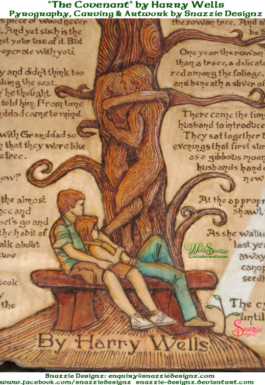
In 2014 Harry Wells (known as Aldwarke on deviantArt) and I completed our third and certainly most ambitious WellSnazzie collaboration to date.

For a full list of all of the WellSnazzie Collaborations please click here.

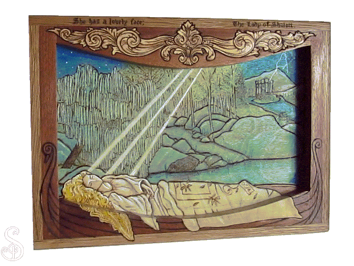
The idea started off initially as a diptych, and evolved into a triptych based on the W.B. Yeats poem “The Song Of Wandering Aengus”. A triptych is a work of art (usually a panel paintings) that is divided into three sections respectively, which are hinged together and can be folded shut or displayed open.

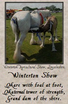
The project went on continuously for three to four months, with the aim of having it completed in time for the Winterton Agricultural Show on 5th/6th July 2014.  We just got it finished the day before the show, and were delighted to find that it had won first place in the “Miscellaneous Crafts” category.

Here’s an account of Harry’s experience of the collaboration process:

International Collaboration on Deviant Art

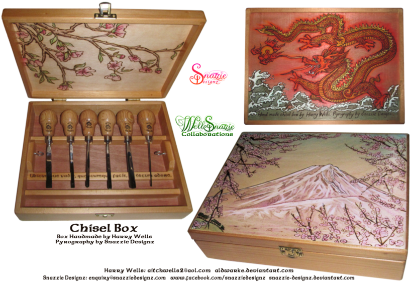
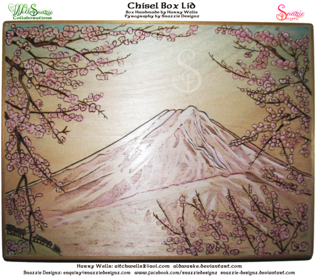
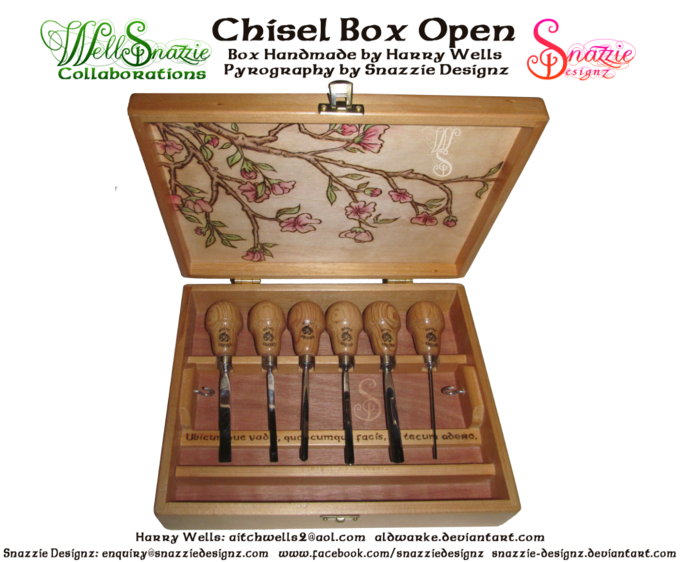
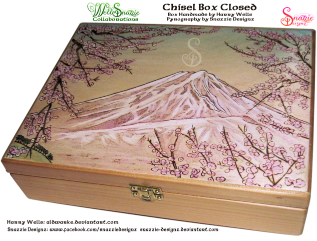
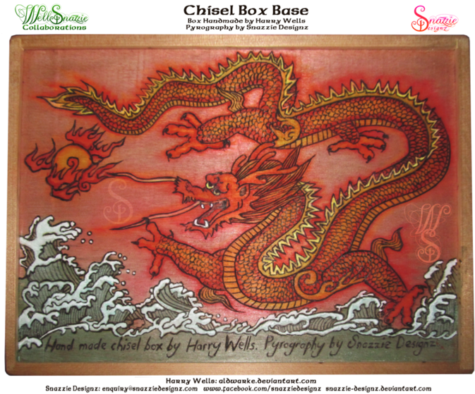
Earlier this year I shared a wonderful collaborative experience with DA member Snazzie-Designz (from here on referred to as Snazzie). Together we made a wooden box to contain runes made by Snazzie.  I  made the basic box which was then decorated by Snazzie to show my name in the Runic script together with my birth sign.

We originally ‘met’ through the pages of Deviant Art and continued much of the design correspondence through this channel and later by email. At times it was necessary to send parts backwards and forwards, Ireland to England. Thanks to DA a wonderful partnership developed. Flushed by this success we decided to do a more ambitious project which Snazzie has submitted to DA.

http://aldwarke.deviantart.com/journal/Collaboration-Reflections-442697462

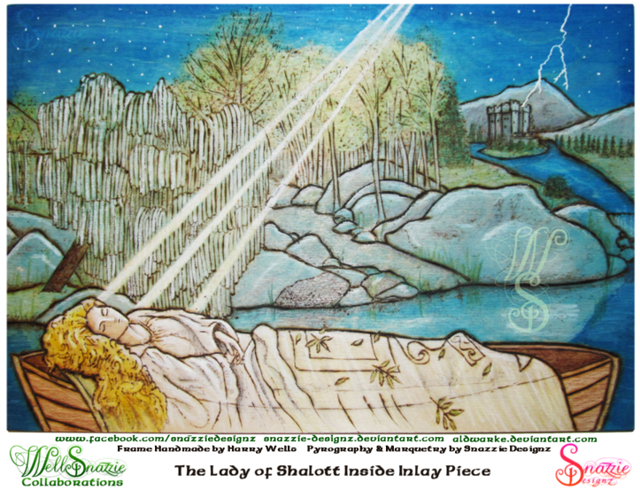
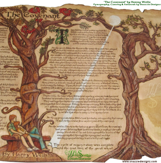
We came up with what we considered to be the ultimate in international collaboration, Snazzie is Irish living in Ireland. I am half Irish/English living in England, so who better to commemorate in our triptych than W.B. Yeats, the Anglo-Irish poet. We chose his mystical poem ‘Song of the Wandering Aengus’.

We co-operated on the triptych for over three months by email and parcel post as various bits and pieces again went back on forth. At one time I began to think that the piece spent more time on the Irish Sea than on land. Eventually it was necessary for Snazzie to come and stay with me for a week in order to get it into shape.

I don’t like deadlines but I was vain enough to want to enter it into a big craft show in England. We finished it in my workshop the night before the show. It was an inspiring though perhaps tiring process at times but from it I learned a great deal from Snazzie about design, patience and personal application to a task.

It was part of my pleasure to see Snazzie working under guidance, with feminine panache, on woodworking machines. Working on a pencil box for herself she used the router table, saw table, planer and had an interesting experience with a Japanese pull-saw – not the slightest sign of blood either.

—– End of Harry’s Commentary —–


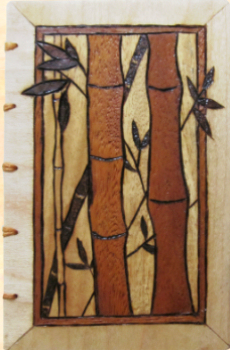
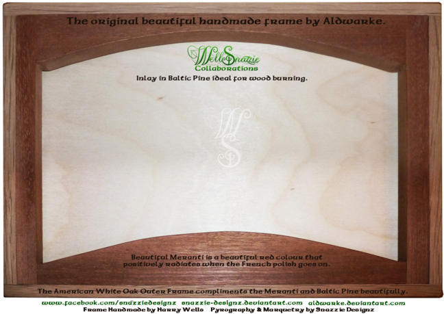
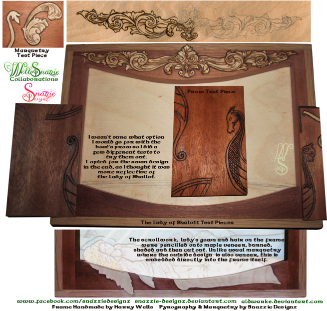
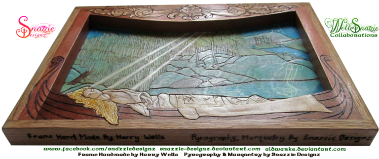
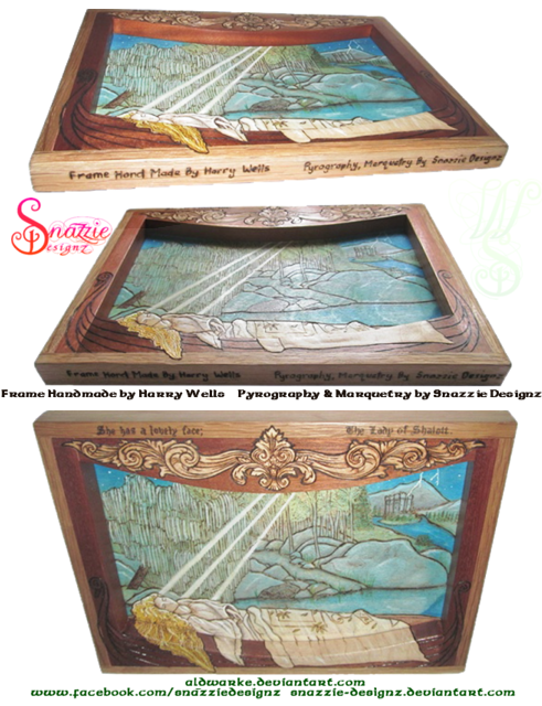
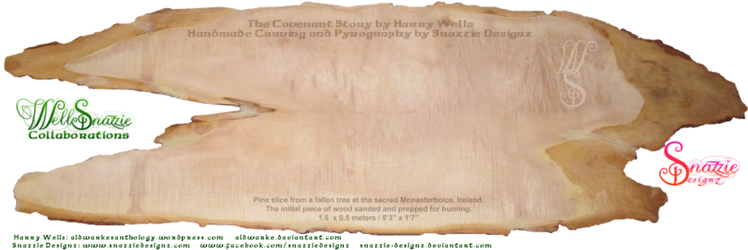
The triptych frame was designed, and hand-made by Harry, including coming up with the innovative idea of sandwiching layers of smooth plywood to a hardwood core to allow for two perfect burning surfaces, front and back, with a strong core to allow the frame to stand upright. When the triptych frame arrived over the Irish Sea to me it was in a self-assembly kit form, and I was astounded at the absolute precision, and alignment of the frames, and the perfectly smooth and clean surfaces I was given to work with. I knew I had my work cut out for me to keep my end of the bargain up.

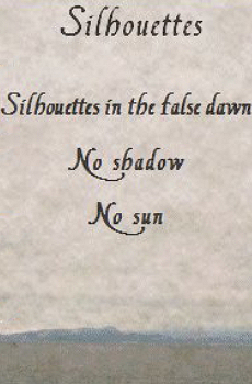
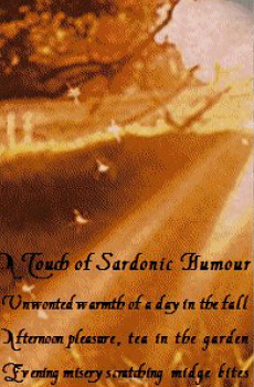
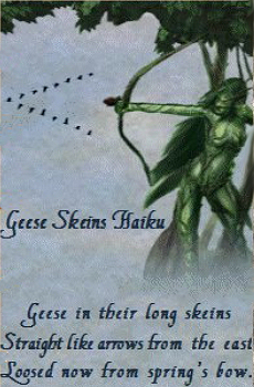
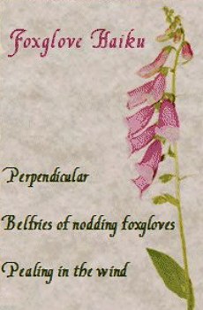
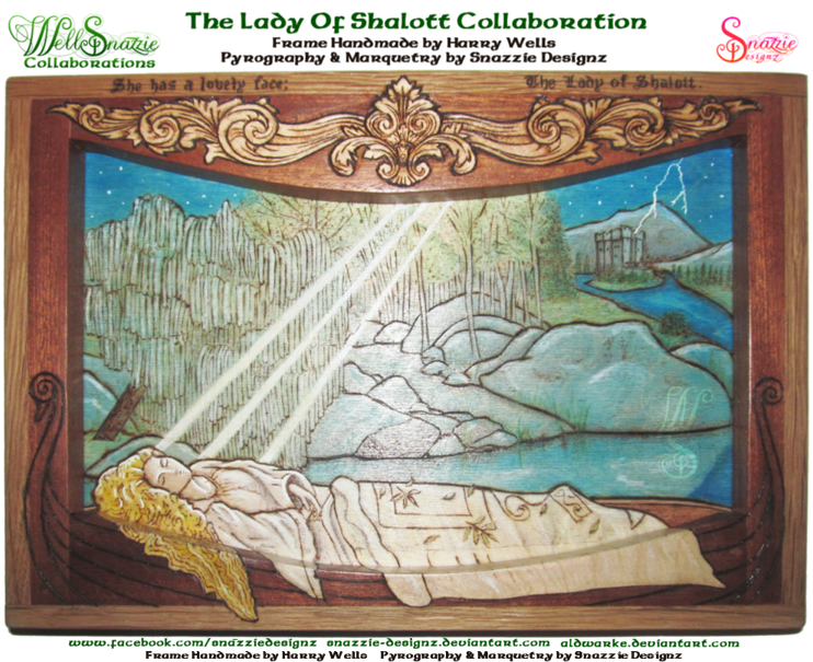
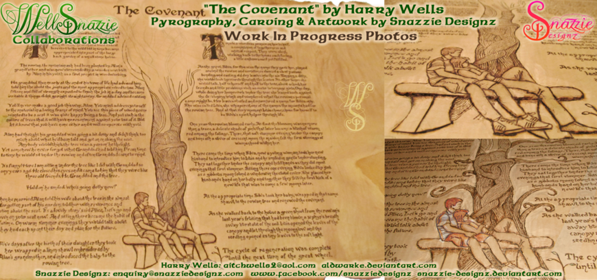
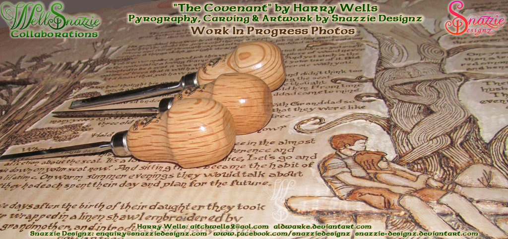
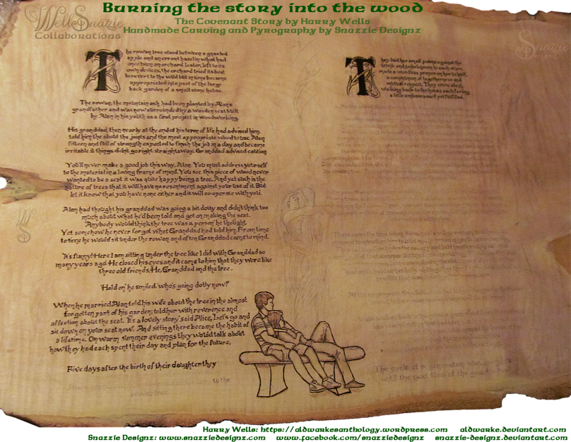
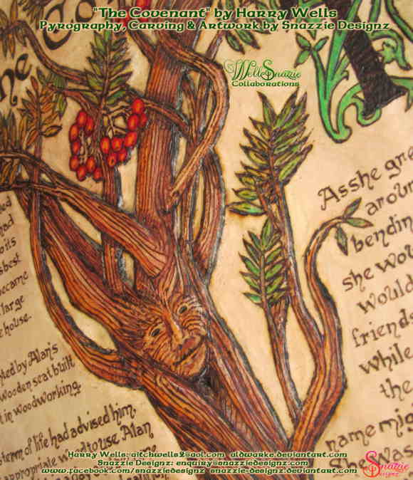
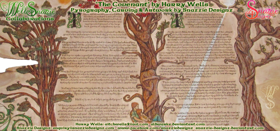
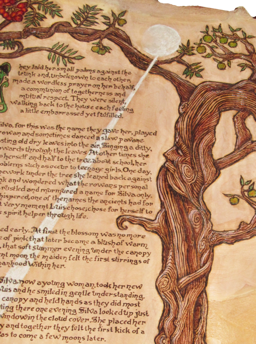
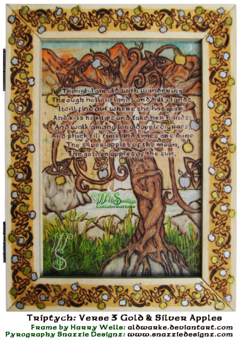
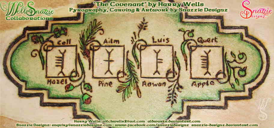
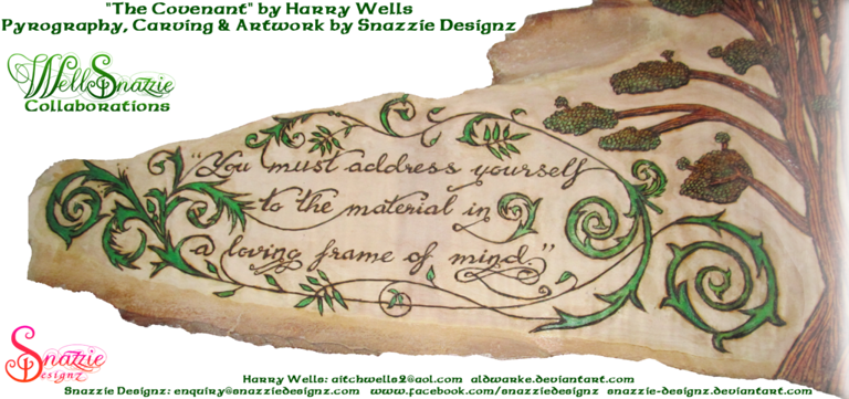
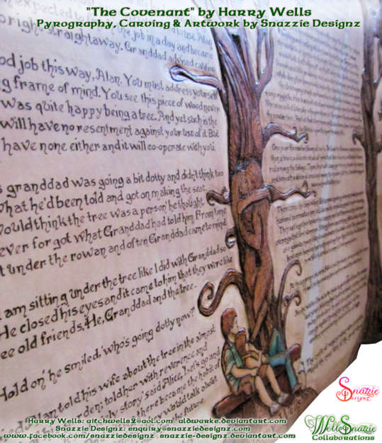
All of the parts were burned separately. The outside edges of the frames have a hand-burned chequered pattern which took 3 weeks to do. The link between each of the verses is blossoms and fruits of trees, so each frame has similar knotwork, but with fruit corresponding to the verse. The panels themselves contain original artwork corresponding to the verses.

When the pieces were burned and ready for finishing and assembly I was delighted to have the opportunity to visit Harry the week before the show, and it was even more of a delight to work with him in person than it has been to collaborate over emails. I am eternally grateful for having been made to feel so welcome by both Harry and Pam (a prodigious artisan herself) who opened their home wholeheartedly to this unknown stranger, so much so that I felt right at home there.

People often underestimate the skill involved in the finishing process, and many of my earlier projects have been destroyed by using the wrong products to finish it, or using them incorrectly. Harry has vast experience of these techniques, and deftly and perfectly finished all of the pieces. The sign of a true master is someone who makes it look easy.

Finally it was ready for assembly. Harry had chosen the perfect hinges to match the chequered pattern on the frame edges, and it took the two of us to balance the piece and accurately mount the hinges. When it was complete we both just stared at it from all angles for about fifteen minutes with a sense of disbelief. The piece suddenly made sense, all unified into completeness, and has now become more than the sum of its parts.

In the days after the show, we had some time to spare, so Harry was kind enough to show me how to make my very own box; a first for me. There were quite a few “firsts” for me in that process; the first time using a router, the first time using a band saw, the first time using a plane, the first time using a circular bladed table saw to name but a few. All of these machines seemed fairly daunting monstrosities, but with Harry’s excellent guidance, encouragement and blind faith, I managed to use them and even started to get the hang of one or two of them by the end of the day. There wasn’t even one instance of him cowering in a corner in terror whilst watching this newbie work with his valued machinery, which I thought showed true grit! I now have a beautiful pencil box as an eternal keepsake of this wonderful journey, and look forward to the next WellSnazzie collaboration with excitement.

If you want more information on HOW THIS WAS MADE seeing work in progress pictures, and sample pieces the burning and construction process,that didn’t make it to the final piece, click here.

Song of Wandering Aengus Triptych Test Pieces snazzie designz

WellSnazzie Collaborations Logo by snazzie-designz

For a full list of all of the WellSnazzie Collaborations please click here.

Save