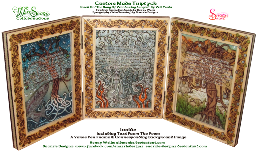
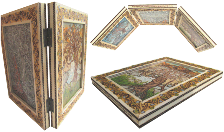
Harry Wells (Aldwarke on deviantArt) and I have just completed our third and certainly most ambitious WellSnazzie collaboration to date. This is a unique handmade triptych inspired by the beautiful poem “The Song of Wandering Aengus” by William Butler Yeats. Harry Wells hand made the triptych and I did all of the pyrography (wood burning) to decorate it with the words of the poem in three verses along with imagery of each verse, one per panel.
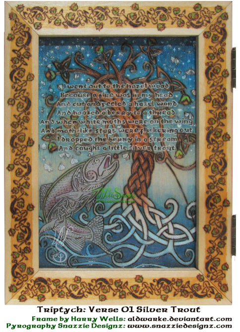
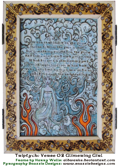
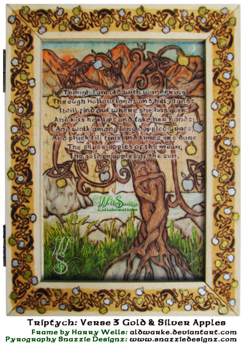
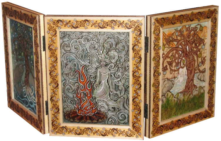
This document is an elaboration of the design process, work in progress, and the craft side of the triptych project. The collaboration pushed us both out of our comfort zones, and has required us to come up with innovative solutions that we haven’t tried before. Harry’s patience, encouragement and willingness to share his vast knowledge of woodworking were a great safety blanket in allowing me to try new things, and the chequered pattern on the frame edges, the combination of masking tape and masking fluid to prevent bleeding under the masking tape, and the use of ink applied in the style of a French Polish rubber to give a dappled grass effect, were just some of the many innovations that came out of the process.

The Design:
The idea began initially as a diptych of a mediaeval book, and evolved into a triptych of a Yeats poem. I am always intrigued by the design process, and how the final piece ends up in some ways dramatically changing from the original design, and yet maintains the core spirit of the original. It all began with a very rough mock-up, and how it ended up as the final piece is somewhat a mystery to me despite working on the project. How a design develops and grows gradually over time due to an idea here from one person, and then an idea there from the other is a strange and wonderful process. The final piece scarcely resembles the original design, yet contains all of the elements within the initial design, transformed by mutual influence of its surroundings. The final piece also reflects both of our personalities.

Beginnings:
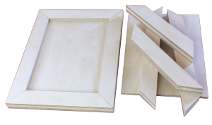
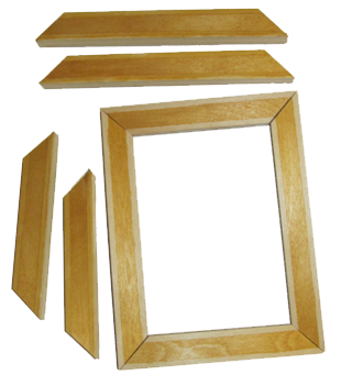
Once we had agreed on a theme, the project began with a rough mock up from Harry, which was fantastic in many ways as we could instantly see that we would need to pick appropriate dimensions, and size hinges correctly. The other major thing was that it was clear that the panels would have to be thick enough to be free standing, however most solid woods are not especially friendly to pyrography, so Harry came up with the innovative idea of sandwiching layers of smooth ply to the front and back of a hardwood core to allow for two perfect burning surfaces, with a strong core to allow the frame to stand upright, and hold the hinges.
 |
Harry also came up with the idea of having the panels framed which added new levels of finesse to the project, and most wisely suggested that he send over the triptych in parts so that if I made a mistake on one section, we could just replace that part. There’s no “undo” in wood burning, so this took a lot of pressure off me during the burning process.
|
The Frame:
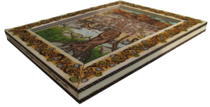
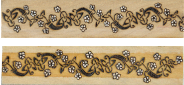
I decided to begin with the frames, the absolute precision and alignment of which made it much easier for me to measure out, align and burn the knotwork. Since the frames were made of sandwiched plywood and hardwood as described above, the plywood made neat little stripes along the edges, and I decided to make a feature out of them, so I burned a chequered pattern of tiny squares which took 3 weeks to do. (I tried several different patterns before choosing the chequered one in the end).
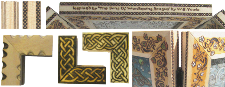
Some innovative ideas, beautiful as they were, didn’t make the final design such as Harry’s beautiful “Scalloped” edges which bring subtle stripes of colour within. We thought that they would be too much with the knotwork on the frame so we opted for plain edges. We’ll save the scalloped edges for another project though. That’s the beauty of good ideas… they carry through to the next projects.
Various knots were tried and tested for the frames before coming up with the final vine-style knotwork which allowed for individual fruits corresponding to each verse and also allowed for movement in the gluing process of the frame assembly at the mitre joints. The frames were tinted on an inner frame to give depth to the knotwork, and the knotwork was then burned on to individually match the verses. Since they were all in parts, I had to use a very strict labeling system to ensure that all four sides corresponded, and that the knotwork on the back of verse 01 was verse 03 knotwork.
 |
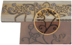 knotwork of the frames so test designs for burning the tiny width of the inside frames I came up with some interesting ideas, that in the end turned out to be unnecessary due to a re-design of the trees. knotwork of the frames so test designs for burning the tiny width of the inside frames I came up with some interesting ideas, that in the end turned out to be unnecessary due to a re-design of the trees. |
|
|
The Panels:
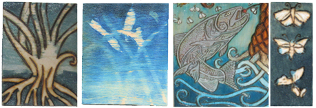
I came up with a design based on the mock-up. Each element within each panel went through several versions before a final design was chosen, and that in turn would affect other elements within the panel which would require adjustment to fit in style-wise. Then each element was individually tested on the generous supply of scrap pieces of wood kindly provided by Harry.

When it came to burning the panels, each element that had been individually designed then went through individual test burnings to ensure that the right look was achieved.
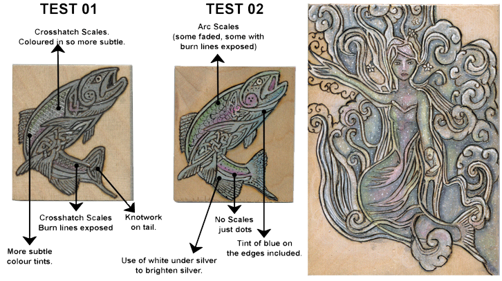
The “long dappled grass” test piece revealed that it would make more sense to burn the negative space between the blades, rather than the grass itself, and I drew a few strange looks whilst staring at the grass to contemplate the space between each blade, and how to represent it. This was my first time burning negative space.

Harry’s willingness to share his vast knowledge of woodwork was not only directly very helpful, but it also inspired some solutions indirectly. To get the dappled effect I modified a French Polishing technique he had taught me and used a rubber and some ink to get the effect of shadows and dapples in the grass. It doesn’t photograph particularly well as the effect is quite subtle.
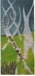 |
This is the first project where I used ink on wood. I prefer ink to paint as it stains the wood, and you can still see the grain rather than some paints which mask the wood. Using ink on wood is difficult though as it bleeds. I had to run several tests with masking tape, frog tape (a more expensive masking tape that’s supposed to prevent seepage, but which had no discernible difference to me except being 8 times more expensive). The masking tests went terribly wrong!As can be seen, ink bleeds disastrously under duct tape, and whilst sometimes leaving some pretty effects, it is not what I needed for this project. I needed to find a way of masking the ink completely. I saw a new product called Frog tape which is very expensive and is designed to prevent seepage under the tape, but it ended up being only marginally better than duct tape. The eventual solution was to mask it with tape, then cover the back with masking fluid.
|
From Paper To Panel:
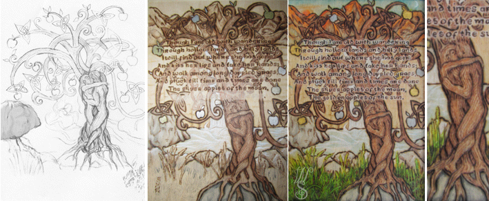
Work in progress from paper design, to burn lines and shading, to final full colour full finished piece.
 |
The Finishing Process:People often underestimate the skill involved in the finishing process, and many of my earlier projects have been destroyed by using the wrong products to finish it, or using them incorrectly. Harry has vast experience of these techniques, and deftly and perfectly finished all of the pieces. The sign of a true master is someone who makes it look easy.Several test pieces were used to determine the best finish for the final piece. The finishing gets especially complicated when using colour on the pyrographs. Certain colour media (colouring pencils, ink etc.) clash with certain finishes, and if you use a combination of colour media it requires quite a bit of understanding of what sealants are required for each type. Fixative spray for example is perfectly fine on colouring pencils and ink, but makes Sharpies run and bleed. Water-based varnish makes ink bleed, makes colouring pencils go pale, but has no ill-effects on Sharpies.French polish and other finishing products such as varnish, they yellow the wood a bit when they dry, so that needs to be taken into account with the colours chosen. Any pale blues come out looking green if you chose the wrong shade.Each part of each panel had to be individually sealed separately with a very small brush to seal the colours, and then it was ready for French polish. My polishing is not up to scratch, and ends up looking streaky and uneven but fortunately Harry have the experience to do several thin layers that build up to a beautiful smooth, gleaming and strong finish. |
Final Assembly:
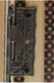 |
Finally it was ready for assembly. Harry had chosen the perfect hinges to match the chequered pattern on the frame edges, and it took the two of us to balance the piece and accurately mount the hinges.When it was complete we both just stared at it from all angles for about fifteen minutes with a sense of disbelief. The piece suddenly made sense all unified into completeness, and has become more than the sum of its parts. I’m looking forward to the next WellSnazzie collaboration with eagerness.
|
For more information on the collaborative process for this project click here:

Please click here for details of our Triptych collaboration process.
For a full list of all of the WellSnazzie Collaborations please click here.

 Aug.3,2014

 Tags :