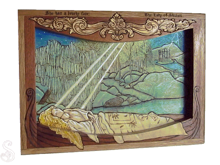
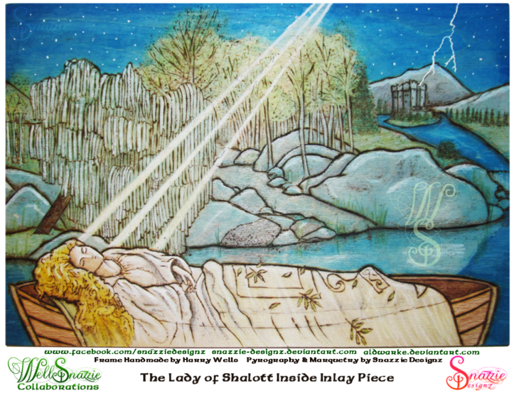
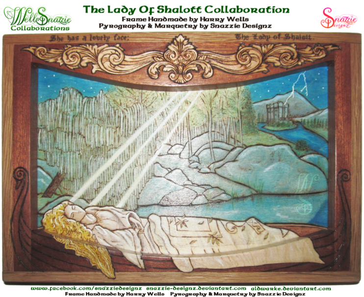
This is a handmade framed pyrograph (wood burning) of “The Lady of Shallott” based on the Alfred Lord Tennyson Poem (1842 Version Part IV).
This stunning handmade frame is made by Aldwarke. Loosely inspired by Kit Williams pieces, Aldwarke took an idea and created something truly spectacular with it. The combination of American oak and meranti are such a complimentary pairing, and show off the Baltic pine background beautifully. Baltic pine is ideal for wood burning also, so that makes my job so much easier. The frame was made so seamlessly that the Baltic pine background sloted in snugly. This had great significance when it came to the woodburning, as any slippage would have resulted in misalignment and disaster. Details that people often overlook in such things are the finish and the surface. The frame arrived clean, and sanded so smoothly that it looked polished. Working with this type of piece makes my part so much easier.
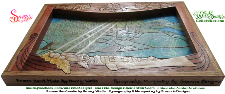
Starting with a stunning frame hand made by  aldwarke my initial thoughts were Wow! It’s beautiful… please don’t let me mess it up! My second thought was that I needed to turn it upside down!
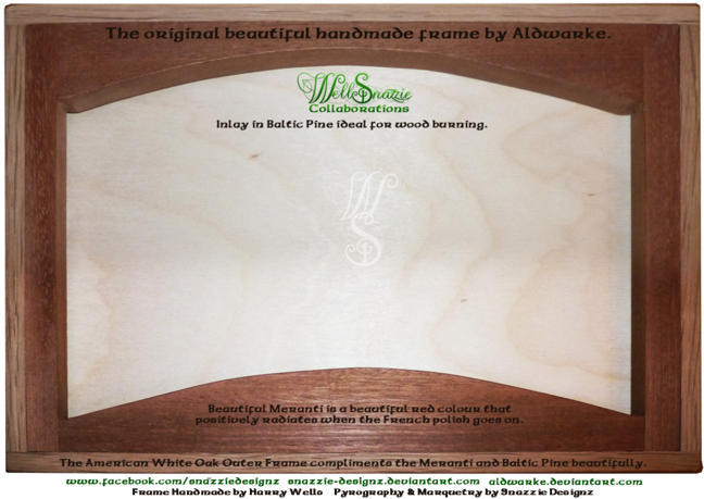
The inside backing piece on it’s own. Made of Baltic pine it was a lovely surface to burn, and Adwarke’s precision in sizing it meant that it fitted snugly into the frame with no slipping, allowing me to align this with the extension of the picture onto the frame itself.
As soon as I saw the curve I knew I wanted to make that curved edge represent the edge of the boat, and have her hair and robes flow over the edge as described in the poem. How to achieve that was a new challenge. Meranti wood is a beautiful rich colour for the frame, but it would be too dark to represent the white robes described in the poem. I decided to give marquetry a go for the first time.
It was not an easy decision for me to try it, even after a reasonably successful test piece. I took it down and put it back on the shelf again for several months thinking about it. Even after months, I couldn’t see the frame in any other way than as part of the boat though, so in the end I just had to hope for the best, and to be very grateful for Aldwarke’s understanding and blind faith in me!
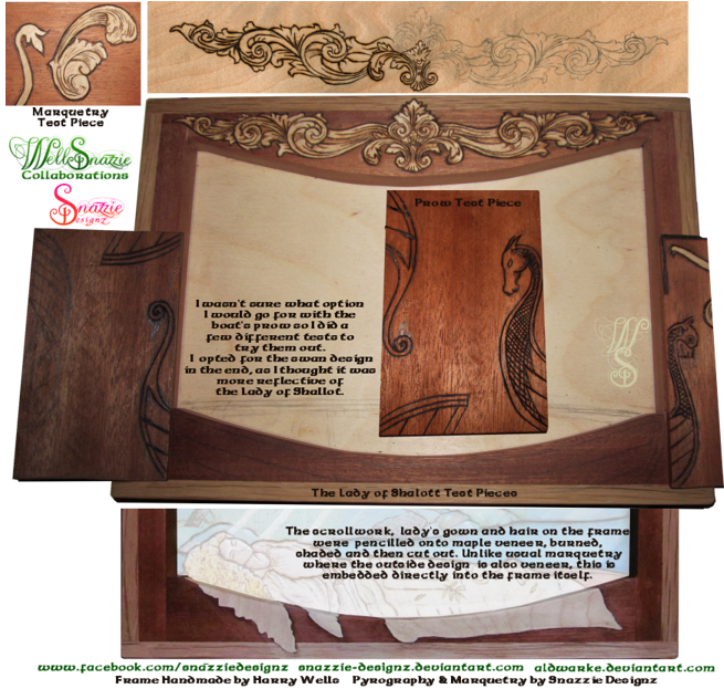
The scrollwork, the lady’s gown and hair on the frame were all done with marquetry. I penciled onto maple veneer, burned, shaded and then cut out each piece individually. This was a tricky business with veneer having a tendency to split. I used masking tape on one side to reduce the likelihood of splitting.
Once cut out, I had to size and position the veneers very precisely on the frame. Unlike usual marquetry where the outside design is also veneer, I didn’t want to hide Aldwarke’s beautiful frame, so I had to carve directly into the frame itself, knowing that any slip ups were not going to be able to be undone, and the frame would be destroyed. Once in place, I traced around the cut out veneers, and then chiselled out a hole the exact size into which the veneer would slot. For the most part I got it right in the end I think. I just did the robes and hair freehand as they had to align precisely with the inner picture, and with the horizontal pieces.
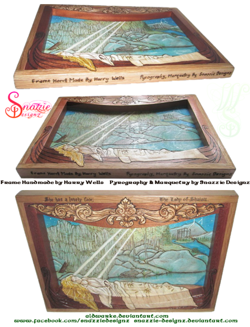
I wasn’t sure what option I would go for for the boat’s prow so I did a few different ones to try them out. I opted for the swan design in the end, as I thought it was more reflective of the Lady of Shallot. The boat on the inner picture had to line up precisely with the frame or the whole thing would be a mess. Thankfully Aldwarke’s absolute precision came to the fore here, and his excellent skills meant that the backing fitted so snugly that it didn’t move at all. Such skill is to be envied.


 Jun.2,2018


 outlines and shading")


 Tags :

